
How might we help users access the digital product that provides functional minimalism and stress-free meaningful interactions between parents and teachers?
Design Challange
Most existing school applications have limited functionality and issues with their usabilities, such as their Lack of Understanding of the Target Audience and complicated and unclear design language.
SchoolMate Nuvo integrates all functionalities of the school. This is a comprehensive, administration software which helps to facilitate the day-to day office administration and campus management in the school, whether it is student or staff information, fees or stores, accounts or rank listing, SchoolMate has all features to help the school management, principal, teachers, office staff, parents and student community when it comes to data or information regarding attendance, marks performance analysis, fees, etc.
My Role: Lead UX Designer
Team: Design team of 3, Engineering team of 4, Business team of 1
Responsibilities: User Experience Design, Wireframes, User Interface Design, Ideation, UX Research
Timeline: 16 weeks
Software: Figma, After Effects, Miro
The app offers personalized management of kids for the parents, you can get the information about your kids including fees details, examination results and exam notifications, daily assignments, student gallery, chatting options with teachers and much more. They can also manage multiple kid's information at a time.
The teachers can manage the kids which are assigned to them.
The management can access both the student and teachers details. By logging into the app the user are given the choice of choosing the account type.

Parent Home
Parent can Know all the details of their child by tapping on any of the options in the home
screen

News
School upcoming events and notifications are
listed in categories.


Payment
Penting payments and history of the previous
payments are displayed. Make transaction of the money by adding or selecting card details

Chat
Parents can chat with none teaching staff and teachers.
Exams
Exam notification, results, and upcoming exam details can be obtained.
Our formative research included interviewing 7 parents, 4 teaching staff, and 1 contextual inquiry. We focused on interviewing as many users to understand their pain points. Using this approach, we could uncover how staffs facilitate the day-to-day school activities and administration, and also how parents can enhance communication and Saves time.
We interviewed 5 people who have had various levels of experience using interactive managing applications. This group included parents of the students, caretakers, Grandparents, teaching and non-teaching staff, and also people who rarely use the apps. We sought out motivations for using apps than using paper and pen and also other time-saving benefits which can help stay organised.

Additionally, we conducted a contextual inquiry with someone with no experience in using student apps. This helped us understand how a novice renter feels throughout the rental experience and identify pain-points and mismatched expectations from someone with a fresh perspective. This method included watching the participant marking the student attendance, adding the contents to the workbook and making online fees payments
Functionality is the most critical factor when it comes to Student and staff management apps.
"It's all about the performance." - Participant A
"All in one platform can help to save time." - Participant C
Consumers have a lack of knowledge in using apps as a primary mode of communication.
" Too much information makes confusion."-Participant B
"Old aged users find it difficult to understand complex functionality."-Participant C
"simple interface makes it easy for anyone to use."-Participant C
Users think security is really imortant.
"It's all about the performance." - Participant A
"All in one platform can help to save time." - Participant C
Connecting gives a better experience.
"It is important to make personal one to one communication between parents and teachers."-Participant C
Ideation & Downselecting
Based on our design challenge, we generated many ideas and downselected down to 1 initial concept based on our research and also evaluated based on the potential and feasibility of each concept.

Based on our research, we developed a customer journey map from the perspective of different users to visualize the entire experience a customer goes through. This helped us identify the crucial touchpoints of our design concept so we could focus our energy on the most influential touchpoints on the entire user experience.

As a team, we narrowed down our design concept to focus on 2 major touchpoints, the parent experience and the Teacher experience. We felt that these 2 touchpoints had the largest influence on the overall quality of the experience.
The Parent experience can be painful due to inefficiencies to use the application and unclear needs.
The Teacher experience is more border in nature with more features

Parent Experience
Features
-Fess Management
-Attendance Check and marking
-Academic reviewing
-Receiving notifications
Teacher Experience
-Multiple class management
-Multiple student managing
-Making reviews on assignments
-Uploading images
Site Map
After user testing and solidifying 3 key user flows for our app, we created a site map to visualize the architecture for our product.

User Flow
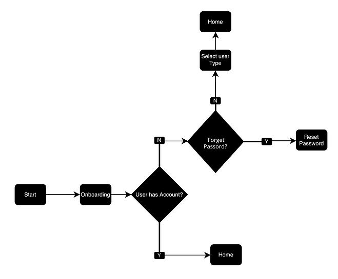
We identified 7 critical paths for the app and created user flows for each path to understand how a user will navigate through our app and to identify the design work needed to support the tasks users need to perform.
Task Flow: Login

Task Flow: Fess Payment
We designed several mockups at various fidelities for faster testing and iteration cycles. Between iterations, we increased fidelity while integrating design changes. Early tests focused more on the role of the product while later tests leaned toward look and feel.

Design System
Typography
Roboto Regular is the primary typeface Cura uses Avenir Next because it appears open, contemporary, and has a visually accessible sty
Heading Large Bold 32px, line height: 38px, tracking: -0.4
Heading Medium Demi Bold 24px, line height: 28px, tracking: -0.1
Heading Small MEDIUM 14PX, LINE HEIGHT: 24PX, TRACKING: 0
Body Medium 16px, line height: 20px, tracking: 0
Button DEMI BOLD 14PX, LINE HEIGHT: 20PX, TRACKING: 0.4
Caption Medium 12px, line height: 16px, tracking: 0
Fine print Medium 10px, line height: 14px, tracking: 0.3
Color
Our brand color conveys calmness and optimism. This creates a visual impact that helps distinguishes our brand. It should be used sparingly on most UI elements. Ideally, the usage should be limited to primary actions or accents within the applicationin order to purposefully communicate how things function in the interface. Our color palette is a full spectrum of bold hues and neutrals to helps us create visual patterns that can make interacting with our product easier and more predictable. P
Primary
Neutral
Error

Iconography
Our icons act as visual aids to help people complete tasks. The icons are simple and informative.

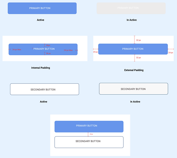
Components
Primary button
Corner radius: 6px
Fill color: #6795EB
Fillcolor(InactiveECEBEB):#09A80
Text color: #FFFFFF
Text style: Button
Secondary button
Outline color: #000000
Outline stroke: 1px
Fill color: #FFFFFF
Fill color (Inactive): #003366
Text color: #FFFFF
Text style: Button

Downloads
School Forms can be download by the parents and also they can get the media files of their kids by tapping download option.

Account Type
User can select the account type during the
first-time login.

Teacher Home screen
Teacher's home screen is different from the
parents and management. Teachers can access the details of all students assigned to them

About me
Parents can view and edit the information of their child. But in the teacher account they can only view for the details
Ask what is the experience we want people to
have?
Even though the goal of Schoolmatenuvo is to try to implement new way of management and behavior users are more familiar with old practices. It is crucial to constantly put ourselves in users' shoes to remind ourselves of the needs and wants of users. By understanding their desires and goals, we can provide a more user-centered design.
Be clear about the "why" behind every decision.
Why do we need Schoolmatenuvo? Does it have to be an all in one app to achieve our goals? That was the question we kept asking ourselves for months. It was a great learning experience to put what we wanted to do aside and focus on what is the best for the product and people.